From Text to Stunning Charts in 60 Seconds: AI Presentation Generation That Actually Works
See how AI generates professional presentations with data visualizations and charts—then learn how to edit specific slides without regenerating everything. Real examples included.
TextDeck Team
Presentation Design

From Text to Stunning Charts in 60 Seconds: AI Presentation Generation That Actually Works
I needed to explain Gaussian noise and Bayesian statistics to a non-technical audience. The kind of topic that makes people's eyes glaze over.
So I typed a single prompt into TextDeck and watched what happened.
The Prompt That Started Everything
Here's exactly what I typed:
"Create a visually engaging presentation that provides an accessible overview of Gaussian noise and Bayesian statistics, including clear explanations and real-world examples. Incorporate supporting graphs and charts to illustrate key concepts."
That's it. No technical specifications. No "please add a histogram." No design instructions.
60 seconds later, I had a complete 3-slide presentation:
The Original Generated Slides
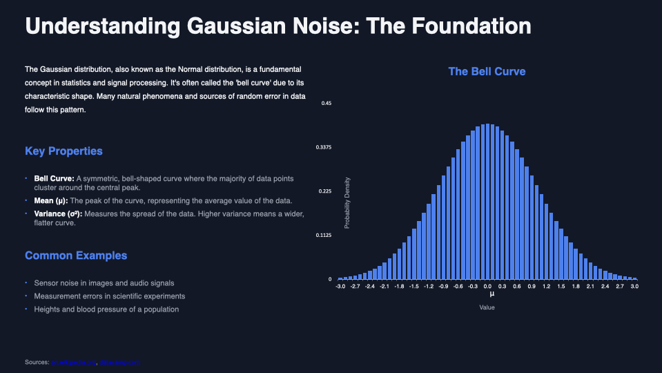
Slide 1 — A full explanation of Gaussian distribution with a histogram that actually shows the bell curve. I didn't create that chart. I didn't specify bar colors or axis labels. The AI understood the concept and visualized it.
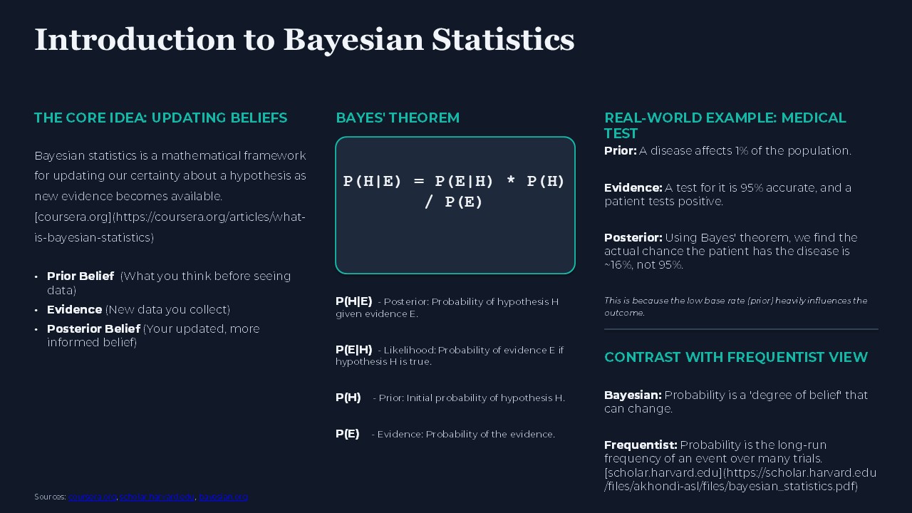
Slide 2 — Bayesian statistics explained with Bayes' theorem properly formatted, a real-world medical diagnostics example, and a clear comparison between Bayesian and Frequentist approaches.
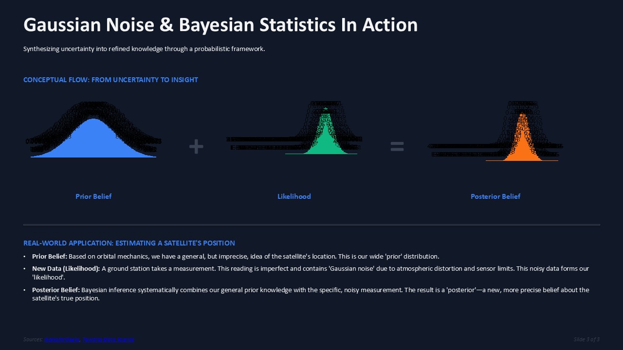
Slide 3 — The synthesis: showing how prior belief, likelihood, and posterior belief work together with actual probability distribution visualizations.
Here's what makes this different: TextDeck doesn't just generate text and hope you'll add visuals later. It creates actual data visualizations, charts, and graphs embedded directly in your slides.
Charts and Data Visualization: Built In
This is what most AI presentation tools get wrong. They generate text. Maybe they add stock photos. But when your topic needs data visualization, you're on your own.
TextDeck generates:
The Bayesian statistics slide includes the actual Bayes' theorem formula, properly formatted, with clear labels explaining each component. No LaTeX headaches. No copy-pasting from Wikipedia.
Then I Wanted Something Different
The slides looked professional. Clean. But I wanted them to look distinctive. Something that would make the audience sit up and pay attention.
Here's where the editing feature changes everything.
Instead of regenerating the entire presentation and hoping for better styling, I selected just slides 2 and 3 in the slide selector. Then I typed:
"Make these slides cyberpunk. Dark purple background, neon cyan and hot pink accents. Keep all the content the same, just transform the visual style. Think Blade Runner meets tech conference."
One click. Same content. Completely different aesthetic.
The Transformation: Before → After
Here's slide 2 after the edit:
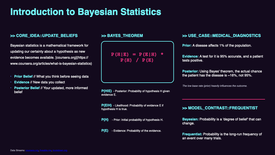
Same Bayes' theorem breakdown. Same medical diagnostics example. Same frequentist vs. Bayesian comparison. But now wrapped in electric cyan headers, hot pink accents, and a deep purple background that looks like a futuristic tech presentation.
And slide 3:
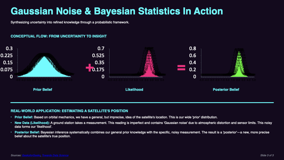
The probability curves now glow with gradients. The axes labels pop with neon coloring. Prior belief, likelihood, and posterior belief—all transformed to match the new aesthetic.
Slide 1 stayed exactly the same. That's the power of selective editing. I only changed what I wanted to change.
Why Selective Editing Matters
Most AI tools make you choose: accept the full output or regenerate everything.
That's insane for presentations.
When you have 10 slides and slides 3 and 7 need work, why would you risk losing the slides you liked? Why regenerate your perfect introduction just because the conclusion needs polish?
TextDeck's editing workflow lets you:
The cyberpunk example above took one edit. Slides 2 and 3 transformed. Slide 1 stayed exactly as generated.
Real Results: What Charts Can You Generate?
Based on my testing, here's what works well:
Statistical Distributions
Business Data
Scientific Concepts
Financial Presentations
The AI interprets your topic and chooses appropriate visualizations. Ask for a presentation about sales growth, you'll get trend charts. Ask about market segmentation, you'll get comparative bars.
The Complete Workflow
Here's how I create data-heavy presentations now:
1. Write a Specific Prompt
Not "make a presentation about statistics" but:
"Create a presentation about customer retention metrics for our e-commerce platform. Include churn rate trends, cohort analysis visualization, and lifetime value by customer segment. Audience: executive team."
Specific topics. Specific data types. Specific audience.
2. Configure Generation Settings
3. Generate and Review
60 seconds later, you have slides with actual charts.
Review the data visualizations. Do they illustrate the right concepts? Is the visual hierarchy clear?
4. Edit Selectively
Maybe the introduction needs more punch. Maybe the conclusion needs a different chart type.
Select those specific slides. Give instructions. The rest stays untouched.
5. Export
Download as PPTX. Open in PowerPoint or Google Slides. The charts export as native elements—you can still edit them if needed.
Why This Beats Building Charts Manually
Time math:
Manual approach:
TextDeck approach:
And honestly? The AI-generated charts often look more professional. Consistent styling. Proper color coordination. No Excel default ugliness.
Design That Doesn't Look Like AI
Here's the thing people worry about: "Will it look AI-generated?"
Look at the cyberpunk slides again. Those don't look like generic AI output. They look like someone with design skills made intentional choices.
That's the edit functionality at work. The first generation gives you professional defaults. The editing lets you push it somewhere distinctive.
"Make it more playful with warmer colors." "Use a minimalist tech aesthetic." "Style this like a high-end consulting deck."
The AI understands stylistic direction, not just content generation.
Start With Charts, Not Without Them
The biggest presentations mistake I see: people create text-heavy slides and promise themselves they'll "add visuals later."
Later never comes. Or it comes at 11 PM before the presentation, and the charts are rushed garbage.
Start with TextDeck. Mention charts in your prompt. Get data visualization from the beginning, when you have time to refine it.
The Gaussian noise presentation took me about 4 minutes total:
Four minutes for three slides with custom data visualizations and a distinctive aesthetic.
Try doing that manually. I'll wait.
Actually, don't wait. Create your own and see what charts the AI generates for your topic. It's almost always more impressive than what you'd build yourself.


